What does each typography (font) style convey about a brand?
While images and colors play a significant role in branding, typography is equally important in communicating a brand’s message and values.
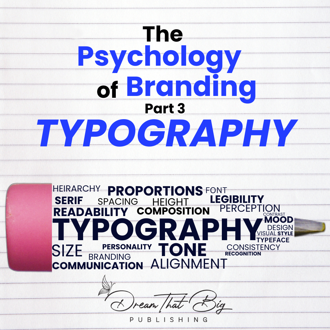
In this final part of our series on the psychology of branding, we’ll explore the psychology of typography in branding and book design and share tips on how to choose fonts that work well together for a cohesive and memorable visual identity.
What is Typography?
In a literal sense, typography is the appearance and style of text.
Figuratively? Typography is much more than that. It is the art and science of arranging and styling typefaces to enhance visual communication. It encompasses various elements such as font selection, spacing, sizing, and layout, all aimed at conveying meaning and capturing attention. One of my personal favorites, The Chicken Soup for the Soul Book brand, is an expert at the use of typography in branding. If you follow the brand from one book to another, the most coherent branding element is their typography.
Put yourself in your consumers’ shoes.
Imagine walking into a bookstore. The bold, elegant script on the cover of a classic novel, the sleek and modern sans-serif font on a contemporary bestseller, or the playful and whimsical letters on a children’s book—these are all examples of typography in action. Have you ever been captivated by text or words on the cover of a book? Many consumers make a decision just based on visual elements alone. In the case of typography, it sets the tone, evokes emotions, and communicates a brand’s personality and values, which influence our purchasing decisions.
The Psychology of Typography in Branding
Now that we have a basic understanding of what typography is, let’s delve into its fascinating role in branding. The psychology of typography in branding explores how the selection and arrangement of typefaces can significantly influence people’s perceptions and attitudes toward a brand.
Typography possesses the ability to evoke emotions, convey messages, and impact readability and user experience across diverse marketing materials. Whether it’s a logo, website, or packaging, the right typography can shape how your audience perceives your brand.
By understanding the psychological aspects of typography, brands can make informed choices about fonts that align with their brand identity and goals. Let’s explore how typography influences emotions, sets the tone, and communicates a brand’s personality and values. We’ll also delve into its impact on readability and user experience, enabling you to make intentional decisions that resonate with your target audience.
How Does Typography Shape Your Brand Identity?
- Conveys Your Brand’s Personality: Typography is one of the essential visual elements that define your brand’s personality. Every font has a unique character and tone that can align with your brand’s voice and values. For instance, serif fonts convey a classic and traditional tone, while sans-serif fonts are modern and minimalistic. By choosing the right typography, you can communicate your brand’s personality and create a lasting impression.
- Enhances Readability: Readability is critical in any book, and typography plays a significant role in making the text legible. The right font size, spacing, and color contrast can improve the reading experience and reduce eye strain. Moreover, using a consistent font style throughout the book can improve readability and make it easier for the reader to focus on the content.
- Creates Brand Recognition: Brand recognition is crucial for establishing a strong presence in the market. Typography plays a crucial role in establishing brand recognition by serving as a key visual element. By using a consistent typography style across all your marketing materials and book covers, you can create a recognizable brand identity. This can make it easier for readers to remember your brand and influence purchasing decisions.
- Sets the Tone for the Book: Typography plays a crucial role in setting the tone and mood of your book. For example, bold and striking fonts like Impact or Bebas Neue create excitement and urgency, while cursive or script fonts like Great Vibes or Sacramento convey elegance and sophistication. The right typography captures the essence of your book and instantly appeals to your target audience.
- Enhance the Overall Reading Experience: You can attain this by creating an aesthetically pleasing and easy-to-navigate layout. Appropriate use of typography styles, such as headings, subheadings, and pull quotes, can break up the text and make it easier for the reader to follow along. Typography styles play a significant role in structuring the content hierarchy and guiding the reader’s attention. Clear and well-designed headings help establish a visual hierarchy, allowing readers to quickly scan and locate information. Subheadings provide further organization and aid in navigating different sections or topics. Pull quotes, strategically placed throughout the text, draw attention to key insights or important passages, enhancing readability and engagement. By effectively employing typography styles, authors and designers can optimize the reading experience, ensuring that the content is visually appealing, digestible, and enjoyable for readers.
Choosing the Right Typography for Your Brand
When selecting typography for your brand, it’s important to consider factors such as legibility, scalability, and compatibility. You want your fonts to be easily readable in different sizes and formats and to work well across different media, such as print and digital. You should also consider your brand personality and choose fonts that match your tone and style.
Creating a typography system for your brand can help ensure consistency and make it easier to choose fonts for different applications. Your typography system should include a primary font for headlines and a secondary font for body text. You can also include accent fonts for use in special situations, such as quotes or callouts.
How to Choose Fonts that Work Well Together?
- Choose fonts with contrasting styles: When selecting fonts for pairing, it’s best to choose fonts with contrasting styles, such as a serif font paired with a sans-serif font. This creates visual interest and helps to differentiate between different types of content.
- Consider font weight and size: Fonts can also be paired based on weight and size. A bold heading font can be paired with a lighter body text font, or a large display font can be paired with a smaller caption font. It’s important to ensure that the fonts are still legible and complement each other.
- Limit the number of fonts used: While it can be tempting to use many different fonts, it’s best to limit the number of fonts used to create a cohesive and consistent visual identity. A good rule of thumb is to use no more than two fonts in a design.
- Use fonts with similar proportions: Fonts with similar proportions, such as similar x-heights or letter widths, can work well together and create a balanced design.
- Test different combinations: It’s essential to test different font pairings to find the right combination that works well for a specific brand or design project. This can be done through mockups and design prototypes to see how the fonts work together in different contexts.
Overall, typography plays a crucial role in branding and book design. Understanding how it can affect readers’ perceptions of a brand allows you to choose the right typography that aligns with your brand identity and goals. Creating a typography system for your brand and limiting the number of fonts used can ensure consistency and create a more cohesive brand image. Remember to choose fonts that work well together, with contrasting styles, similar proportions, and complementary weights and sizes. Following these tips shared through the blog, you can create a typography system that enhances your brand and book design and communicates the right message to your target audience.
Who’s ready to take their writing to the next level?
If you haven’t read Part 1 and Part 2 of “The Psychology of Branding” series yet, be sure to check them out to learn more about the color and image perspective of branding.
If you’re looking to improve your branding strategy, be sure to check out these podcast episodes on Nurturing Relationships, Creating a Magnetic Brand Style, and Growing Your Brand On Social Media.
The other good news, you don’t have to be alone on this book-writing journey. Dream That Big Publishing can help you in every stage of the writing and publishing process. Contact us today to find out more. We also host monthly events, both in-person and virtual, and we have a Facebook community to provide you support when you get stuck. The resources are limitless with Dream That Big!
About Dream That Big Publishing:
At Dream That Big Publishing, we offer a variety of writing and publishing services that will help you every step of the way on your self-publishing journey. Sign up to work one-on-one with a writing coach, read our blog, and listen to our podcasts. We want to empower you to write the book you’ve always dreamed of sharing with the world. Join us for networking and empowerment events that are designed to help you prosper as an author and entrepreneur, aka “authorpreneur.” We also have publishing packages that offer everything you will need, from editing to formatting to marketing your book, so you don’t have to do it all yourself!
Dream That Big published authors keep 100% of their royalties, have a book they are proud of, and have joined a nurturing community that is invested in their success. If you feel that our complete nurturing system is the right fit for your authorpreneur journey, please click here to get started!
References:
- Kotler, P. (2016). Marketing 4.0: Moving from traditional to digital. Wiley.
- Armstrong, G., & Kotler, P. (2015). Marketing: An introduction. Pearson.
- Belch, G. E., & Belch, M. A. (2018). Advertising and promotion: An integrated marketing communications perspective. McGraw-Hill Education.
- Berger, J. (2016). Contagious: How to build word of mouth in the digital age. Simon and Schuster.
- Cialdini, R. B. (2016). Influence: The psychology of persuasion. Harper Business.
- Godin, S. (2018). This is marketing: You can’t be seen until you learn to see. Portfolio/Penguin.
- Kahneman, D. (2011). Thinking, fast and slow. Macmillan.
- Ries, A., & Trout, J. (2017). Positioning: The battle for your mind. McGraw-Hill Education.
- Schmitt, B. (2012). The consumer psychology of brands. Routledge.
- Sharp, B. (2010). How brands grow: What marketers don’t know. Oxford University Press.
-Octoryia Robinson
Facebook
Twitter
LinkedIn